
Timothy W. Bickmore
Bill N. Schilit
FX Palo Alto Laboratory
3400 Hillview Avenue, Bldg. 4
Palo Alto, CA 94304 USA
bickmore@pal.xerox.com
schilit@pal.xerox.com
Digestor is a software system which automatically re-authors arbitrary documents from the World-Wide Web to display appropriately on small screen devices such as PDAs and cellular phones, providing device-independent access to the Web. Digestor is implemented as an HTTP proxy which dynamically re-authors requested Web pages using a heuristic planning algorithm and a set of structural page transformations to achieve the best looking document for a given display size.
|
Access to World-Wide Web documents from personal electronic devices has been demonstrated in research projects [2,10,17,18], and is now becoming a commercial reality. General Magic's Presto!Links for Sony's MagicLink, AllPen's NetHopper for the Newton and Sharp's MI-10 (Figure 1, shown at right), all provide WWW browsers for PDA class devices, while the Nokia 9000 Communicator and Samsung's Duett provide Web access capabilities from cellular phones. |
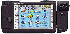 Figure 1. |
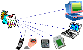 Figure 2. |
Unfortunately, most pages on the World-Wide Web are designed for display on desktop computers with color monitors having at least 640x480 resolution, and many pages are designed with even larger monitors in mind. This disconnect can lead to a 4-to-1 (or greater) ratio of designed vs. available screen area, making direct presentation of most WWW pages on these small devices aesthetically unpleasant, un-navigable, and, in the worst case, completely illegible. This presents the central problem addressed by this work; how to display arbitrary Web pages which have been designed for desktop systems on personal electronic devices which have much more limited I/O capabilities. |
There are four general approaches to displaying WWW pages on small screen devices: device-specific authoring; multiple-device authoring; client-side navigation; and automatic re-authoring.
Device-specific authoring involves authoring a set of WWW pages for a particular display device, for example a cellular phone outfitted with a display and communications software such as the Nokia 9000. The basic philosophy in this approach is that users of such specialty devices will only have access to a select set of services, and the pages for these services can all be designed up-front for the device's particular display. Information may be provided from the world-wide web at large, but the desired pages must be pre-defined and custom information extraction and page formatting software must be written to deliver the information to the small device. This is the approach taken in Unwired Planet's UP.Link service [16] which uses a proprietary mark-up language (HDML).
In multiple-device authoring, a range of target devices is identified, and mappings from a single source document to a set of rendered documents are defined to cover the devices within the range. One example of this is the StretchText approach [8], in which portions of the document (potentially down to the word level) can be tagged with a 'level of abstraction' measure. Upon receiving the document, users can specify the level of abstraction they wish to view and are presented with the corresponding detail or lack thereof. Another example of multiple-device authoring is HTML cascading style sheets (CSS) [13]. In CSS, a single style sheet defines a set of display attributes for different structural portions of a document (e.g., all top-level section headings are to be displayed in red 18-point Times font). A series of style sheets may be attached to a document, each with a weight describing its desirability to the document's author. The user can also specify a style sheet, as can the WWW browser (the 'default' style sheet). Although the author's style sheets normally override the user's, the user can selectively enable or disable the author's, providing the ability to tailor the rendering of the document to their particular display.
In client-side navigation, the user is given the ability to interactively navigate a single web page by altering the portion of it that is displayed at any given time. A very trivial example of this is the use of scroll bars on the document display area. A much more sophisticated approach is that taken in the PAD++ system [3], in which the user is free to zoom and pan the device display over the document with infinite resolution. Active Outlining [11] has also been implemented as a client-side navigation technique, in which the user can dynamically expand and collapse sections of the document under their respective section headings. Other techniques which fall into this category include semi-transparent widgets [12] and the Magic Lens system [4].
Finally, automatic re-authoring involves developing software which can take an arbitrary web document designed for the desktop, along with characteristics of the target display device, and re-author the document through a series of transformations so that it can be appropriately displayed on the device. This process can be performed either on the client, on the server, or on an intermediary HTTP proxy server (as in [7]) which exists solely for the purpose of providing these transformation services. An example of this latter approach is the UC Berkeley Pythia proxy [9], which performs transformations on web page images, although the focus of this work is on minimizing page retrieval time, not on producing the most appropriate page layout for the display device.
There are many possible automatic re-authoring techniques, which can be categorized along two dimensions: syntactic vs. semantic and transformation vs. elision. Syntactic techniques operate on the structure of the page, while semantic techniques rely on some understanding of the content. Elision techniques basically remove some information, leaving everything else untouched, while transformation techniques involve modifying some aspect of the page's presentation or content. Table 1 illustrates these dimensions, along with examples of each category.
| Elide | Transform | |
| Syntactic | Section Outlining | Image Reduction |
| Semantic | Removing 'Irrelevant Content' | Text Summarization |
Each of the four approaches--device-specific authoring, multiple-device authoring, client-side navigation, and automatic re-authoring--has benefits and drawbacks. Device-specific authoring will typically yield the best-looking results, but limits the user's access to a small select set of web pages. Multiple-device authoring, while less total effort per document than device-specific authoring, still requires significantly more manual design work than simply authoring for a single desktop platform. Client-side navigation holds promise if a good set of techniques can be developed, but the 'peephole' approach taken in PAD++ seems very awkward to use for large documents, and the active outlining technique has limited applicability since most web pages do not use a strict section/sub-section organization. Automatic re-authoring is thus the ideal approach to providing broad access to the web from a wide range of devices, if it can be made to produce legible, navigable and aesthetically pleasing re-authored documents without loss of information.
In order to gain an understanding of the process required of an automated re-authoring system, a study was conducted to assess the characteristics of typical web pages, and to identify candidate re-authoring techniques through the process of re-authoring several web pages by hand.
A relatively small sample of 'typical' web pages--the Xerox Corporate web site [20]--was initially selected to focus the study. This collection of 3,188 web pages is representative of a state-of-the-art, professionally-designed site. A variety of statistics were collected on these pages using a web crawler, to help gain an understanding of the structure and content of a typical page. These statistics generally agree with other, larger-scale studies that have been performed across the entire web [6,19].
Next, a subset of the pages in the Xerox web site was selected for manual re-authoring. A set of pages from the Xerox 1995 Annual Report were selected and converted by hand for display on a Sharp Zaurus PDA with a 320x240-pixel screen. Detailed notes were kept of the design strategies and techniques used.
Some of the design heuristics learned during this process were:
In conclusion, to perform document re-authoring two things are required: a set of re-authoring techniques (a 'bag of tricks'), and a strategy for applying them. Of the techniques used in the manual re-authoring study, those most amenable to codification were the syntactic elision techniques (section outlining, first sentence elision, image elision) and the syntactic transformation techniques (image size reduction, font size reduction). The design strategy learned during the study consisted of a ranking of the transformation techniques (i.e., try this before that) and a set of conditions under which each transformation or combination of transformations should be applied.
Following the results of the study discussed above, there are two major elements to Digestor's design: a collection of individual re-authoring techniques which transform documents in various ways; and an automated re-authoring system which implements a design strategy by selecting the best combination of techniques for a given document/display size pair.
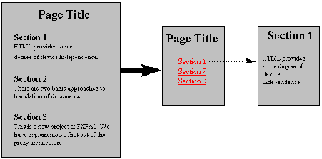 Figure 3. |
Section header outlining techniques provide a very good method for reducing the required display size for structured documents, such as technical papers and reports. The outlining process is depicted in Figure 3 at right. The contents of each section is elided from the document and the section header is converted into a hypertext link which, when selected, loads the elided content into the browser. When confronted with multiple section levels (sections, subsections, sub-subsections, etc.), there are two approaches to performing the elision. The first--full outlining--works by keeping only the section headers and eliding all content, with the results looking like a table of contents for a book. In the second approach--to-level outlining--a cutoff level in the section hierarchy is determined and all content below that level (including lower-level section headers) is elided, but all content above that level is kept. |
Since most pages have text blocks, even when no section headers are present, first sentence elision can be a good way of reducing required screen area. In this technique, each text block is replaced with its first sentence (or phrase up to some natural break point), and this sentence is also made into a hypertext link to the original text block.
Images present one of the most difficult problems for automatic re-authoring, because the decision of whether to keep, reduce, or eliminate a given image should be based on an understanding of the content and role of the image on the page. However, image reduction and elision can be applied without content understanding, as long as users are provided a mechanism by which they can retrieve the original image. The approach taken in Digestor is to provide a set of techniques which transform all images in a page by pre-defined scaling factors (25%, 50%, and 75%), and making the reduced images hypertext links back to the originals. In addition to image reduction, three syntactic elision techniques were also developed for images--elide all, first image only, and bookends--in which all images, all but the first, and all but the first and last are elided from the document, respectively. Elided images are replaced with their ALT text when available, or with a standard icon when no ALT text is available, which is also made into a hypertext link to the original image.
|
The overall process of deciding which combination of techniques to apply to a given page for a given client display seems at first to require some form of human artistic ability. However, an automatic re-authoring algorithm has been developed which captures many of the heuristics used in the manual re-authoring exercise, and which does a fairly good job of producing good looking pages for a given display. The basic approach is that of a heuristic planner [1] which searches a document transformation space in a best-first manner. Each state in this space represents a version of the document, with the initial state representing the original 'as-authored' document. The measure of merit (evaluation function) for each state is a rough estimate of the screen area required for the document as it exists in that state. A state can be expanded into a successor state through the application of single transformation technique. At every step in the search process the most promising state (that with the smallest display area requirements) is selected and a transformation applied to it, if possible. As soon as a state is created containing a document version that is 'good enough', the search is halted and that document is returned to the client for rendering. If the search is exhausted and no document version can be found that is good enough, then the best document found during the search is returned. |
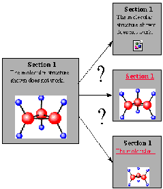 Figure 4. |
Heuristic information is used in several places in the planner, including: the order in which transformation techniques are applied to a given state; the pre-conditions for each transformation technique; and the determination of when a document version is 'good enough' to halt the search. In general, transformations which make minor changes to the document are preferred over those which make more extensive changes (e.g., reducing images by 25% is preferable to reducing them by 75%). The pre-conditions for each transformation technique specify which other transformations they can be combined with (e.g., it makes no sense to apply both full outlining and first sentence elision to the same document), as well as requirements on the content and structure of the document that the technique is being applied to (e.g., only apply full outlining when there are at least three section headers). The current condition for 'good enough' is fairly simplistic; the search is stopped when the area required by a document version is 2.5 times the screen area of the client display (which assumes that the user doesn't mind scrolling the display a little in one direction).
The design described above has been implemented as an HTTP proxy server (as in [7]). The proxy accepts a request for an HTML document, retrieves the document from the specified HTTP server, parses the HTML and constructs an Abstract Syntax Tree (AST), labels each of the AST nodes with a unique identifier, and then retrieves any embedded images so that their size can be determined (as necessary). Once this has been accomplished, the planner is initialized with a state containing the AST for the original document. During each planning cycle, the planner selects the state with the best document version so far, then selects the best applicable transformation technique and applies it resulting in a new state and document version being generated. It is assumed that the convolution of transformations is always commutative, and several checks are used in the planner to ensure that redundant states are not constructed.
Fifteen transformation techniques have been implemented and integrated into the system: FullOutline, OutlineToH1, OutlineToH2, OutlineToH3, OutlineToH4, OutlineToH5, OutlineToH6, FirstSentenceElision, ReduceImages25%, ReduceImages50%, ReduceImages75%, ElideAllImages, FirstImageOnly, BookendImages, and ReduceFontSize. Transformations manipulate the AST in the state they are applied to in order to produce a new version of the document (the manipulations are similar to those described in [5]). Whenever portions of the AST are elided or transformed, an HTML hypertext link is added into the AST referencing the node identifiers of all affected AST subtrees, enabling users to request the original portions of the document that have been modified during re-authoring.
The system is implemented in the Java programming language, and the HTTP proxy server software was based on the MBServler system [14]. In addition to functioning as a true proxy, this system can also respond to requests for certain URLs with documents generated by the proxy itself, which is used to provide the user with forms-based control over the proxy and the re-authoring process. In the worst case the planner produces 80 versions of the document in its search space and takes about 20 seconds to complete on a 75Mhz Pentium (using Symantec's Java JIT compiler).
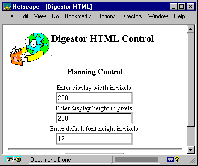 Figure 5. |
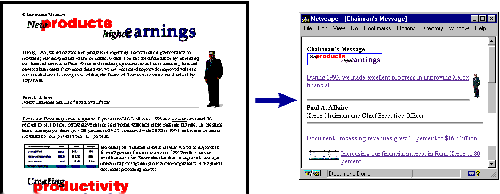
The first thing that a user of Digestor will typically do is specify the size of display for their device, and indicate the size of their default browser font (this is needed in order to estimate the screen area requirements of text blocks). To do this, the user requests a specific control URL from the proxy, resulting in delivery of the form shown in Figure 5. Once users hae configured the system, they can start retrieving documents from the web. The pages below in Figure 6 illustrate Digestor's re-authoring capability. In this example, the system chose to use 25% image reduction in combination with first sentence elision to render the displayed version. Immediately following retrieval of a page, the user can request a trace of the re-authoring session to determine which transformations had been applied by requesting another control URL from the proxy. |
Digestor does a good job of automatically re-authoring web pages for display on devices with small screens. It has been informally tested on a wide range of pages for a number of screen sizes, and it produces output which is always legible and navigable, although not always as aesthetically pleasing as one would like.
There is much work to be done on Digestor before it could be made into a widely usable product. Some of the general issues which need to be addressed include:
Thanks to Joe Sullivan for supporting this research.